.jpg)


Fueled by ☕ lattes and inspired by 🎲 epic board game wins. Let’s design your next big move! ✨
©2026 Aekta Patel. All rights reserved
.png)
.jpg)
Project type
Role
duration
tools
Platform
Park'in is a mobile app designed to simplify the parking experience by helping drivers quickly find, compare, book, and navigate to parking spots. The project focused on reducing the frustration and time associated with searching for parking through intuitive search, filtering, and booking workflows.
Through secondary and primary research, I discovered that many drivers face challenges related to parking. In particular, Gen Z drivers were the most affected by parking situations. Research showed that 80% of Gen Z drivers would cancel plans altogether if the parking situation was difficult.
User interviews revealed that drivers often plan for parking before leaving for their destination. Four out of five participants regularly research parking options in advance, while three out of five actively avoid parallel parking; even if it means paying more or parking farther away. Safety also emerged as a key concern, with participants prioritizing parking locations equipped with security features such as surveillance cameras.
These insights revealed three core user needs:
Park'in was designed to help drivers park with efficiency without feeling stressed by helping them find a secure and convenient parking spot. The app addresses common pain points such as being able to find parking spots quickly in the city, fear of parallel parking and concerns around parking safely.
Park'in addresses a common urban parking challenge while creating value for multiple stakeholders.
By helping drivers quickly find and reserve parking that meets their needs, the app reduces search time, lowers parking related stress, and improves the overall driving experience.
For parking operators, Park'in serves as a marketplace that increases exposure of available inventory and drives bookings.
Revenue would be generated through a commission-based model for each parking spot that was booked via the app, creating a mutually beneficial business model for the parking provider and park'in.
I chose to apply the design thinking methodology due to its human-centered approach. My goal was to develop a solution that truly addresses the users' needs and delivers a meaningful impact.
I chose to focus on the problem space of parking anxiety because it's an issue I personally experience. This inspired me to explore the challenges other drivers face when it comes to parking. Through preliminary research, I discovered the term for it is parking anxiety. It is a term used to describe the fear and stress of not being able to park properly or fear of not being able to find a parking space.
Parking anxiety can be as impactful as a physical disorder; affecting drivers' confidence and overall experience.

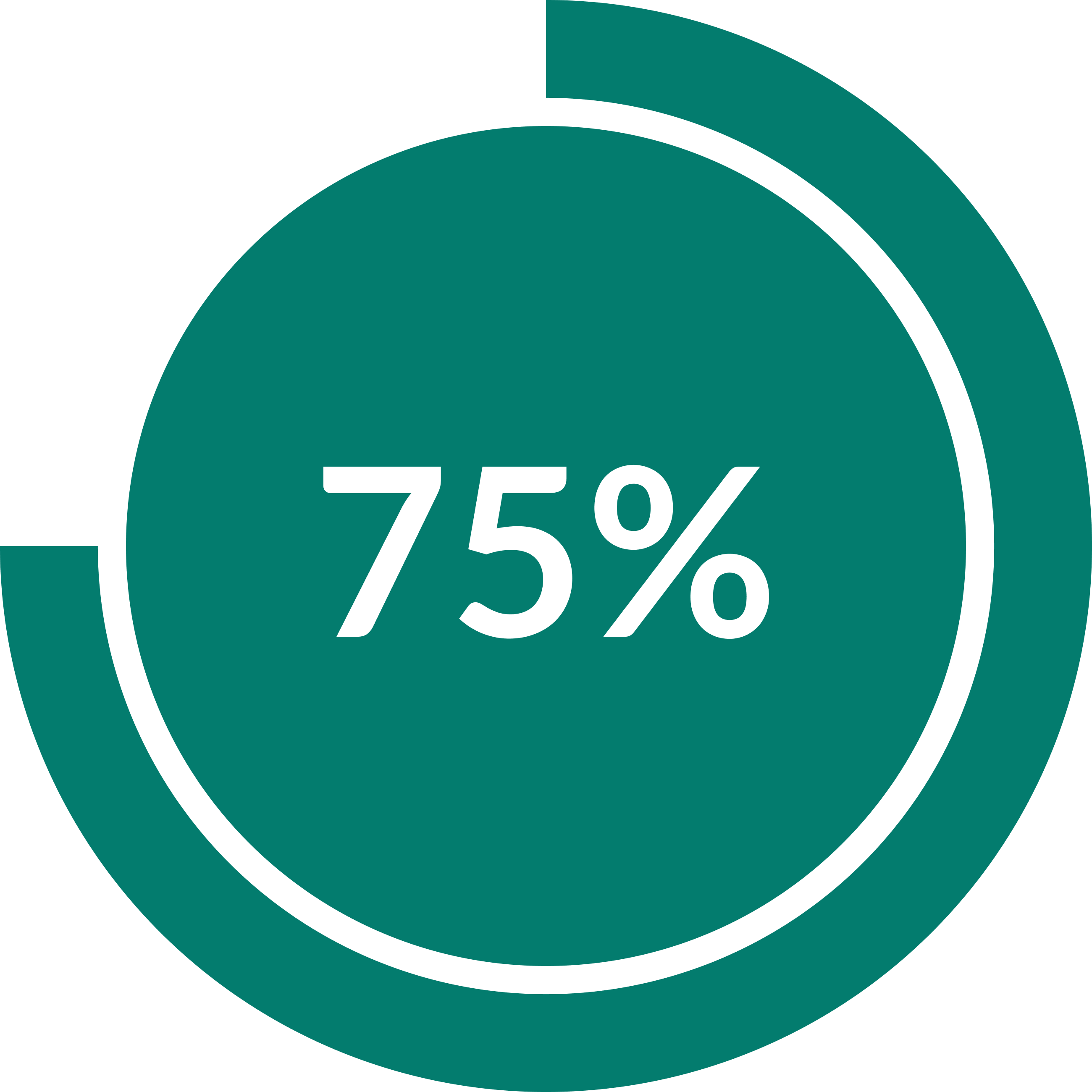

57% of Generation Z uses apps like Uber or public transportation to avoid parking all together
Skipped a social event to avoid troublesome parking.
Have the fear of parallel parking.
I did four 30-minute interviews with drivers that were 18 and older. The requirements included: being licensed, driving at least 4 times a month and located in North America. Once I completed the interviews, I organized the findings into an affinity map, highlighting key themes.

.png)

Safety Concerns
Drivers want to make sure their car is safe from theft and scratches
Parking skill development
Drivers want to learn parking skills to help reduce anxiety.
Time management and efficiency
Drivers get frustrated when spending time searching for parking, understanding signage and attempting to park
.png)
.png)
Cost
Drivers have concerns about paying for parking and understanding and adhering to signage which can lead to tickets.
Familiarity
Drivers prefers parking in the same spot and they face anxiety when they are forced to park in unfamiliar situations.
Time management and efficiency was chosen as time was found to be the most valuable from all the insight that was gathered. Many interviewees were anxious due to not being able to find parking quickly and also not being able to park quickly in the spot they found.
How might we help drivers quickly find parking that matches their preferences to create efficiency before arriving at their destination.
I developed a persona based on the secondary research and interviews I conducted. I kept Sabrina at the forefront to build empathy for the user and create a design with the user in mind.

Based on insights from user interviews and competitive analysis, I identified that parking anxiety was driven less by a lack of available parking information and more by uncertainty during decision-making and arrival. From this, I explored multiple potential directions before defining the final solution.
Driver Education Application - Help drivers through tutorials
Why it was considered: Several participants expressed discomfort with parallel parking which suggested a potential skills gap.
Idea: A learning-based experience to help drivers improve parking skills through tutorials and guided practice (e.g., parallel parking walkthroughs, AR practice environments).
Why not pursued: Interviews suggested users wanted support in real parking situations. A learning focused solution would not reduce anxiety at the moment of parking.
Community Parking Forum
Idea: A forum where drivers share real life experiences about parking locations, including difficulty level, tips and photos.
Why it was considered: Participants reported that they often rely on informal advice or past experiences when choosing parking, indicating trust in peer knowledge.
Why not pursued: Forums are not well suited for time sensitive contexts like driving and parking, where users need fast, structured information. Additionally, the concept relies on significant user scale to generate useful content.
I wanted the app to be different from current parking apps already out there to help fill the gap. I decided to add in a filter spots option to allow users the option to filter things they wanted and things they wanted to avoid.
To further reduce planning effort, I envisioned a calendar integration that would sync upcoming events and automatically suggest nearby parking options, helping users plan their journey in advance.
Based on research findings, I prioritized parking filters, reservation functionality and safety indicators (CCTV cameras). These features addressed most of the common user concerns
Features such as loyalty rewards and reviews were considered, but deprioritized to focus on the core parking experience.

Task flow showing the user's journey from start to finish
I sketched a few paper wireframe variations until I was satisfied with the result. I derived UI inspiration from other apps such as Green P, Uber, Google Maps, Airbnb and Indigo parking. Once sketching was completed, I made a mid-fidelity wireframe.
.jpg)
.jpg)
.jpg)
.jpg)


.jpg)
.jpg)
.jpg)
I chose not to include a gift card number field, as gift cards are unlikely to be part of Park’in’s core offering.
I also de-prioritized the intersection field in the address input, since the app already provides built-in navigation, making this feature seem redundant.
While integrating a full-in-app navigation for Google Maps or Apple Maps into the app could improve familiarity for users who prefer those navigation tools, it would also introduce significant engineering effort for an experience that already meets user needs through existing navigation options. I also wanted the app to be a one stop shop
However, an alternative, such as a “Open in Maps” feature would be a more feasible next step. It would allow users to seamlessly continue navigation in their preferred mapping app.
Iterations were made after each usability test on the mid-fidelity. Two usability test sessions were done. Below are a few of the main changes that were made.
.jpg)
Problem: If there is a few parking spots a driver would like to park again at; there is no way to save them for the future.
Solution: Adding a favorite icon to allow drivers an area to access where their saved parking garages/spots are for the future. I considered having a saved section instead but thought favourite would be better as it's a spot the user likes.
Also took off the park'in logo from the top of the screen to bring focus to the rest of the screen.

Problem: Drivers stated they sometimes are unable to locate the entrance of the parking lot. It is difficult to share the address with friends and family. It sometimes is hard to find the parking location since no picture of the entrance is there
Solution: Adding a picture of the entrance of the parking lot as the first picture, makes it easy for drivers to navigate. Adding a copy feature to allow drivers to copy the address. Also added a favorite button which would allow drivers to save the parking location. A few images were added of the outside and inside of the parking lot as this would allow users to easily find the parking lot.
I wanted users to feel calm while using the app. So I picked colors with cool tones. Blue and teal are known to be calming colors and white is known to be peaceful. I also noticed that many of the pictures to do with calmness had gradients in them. So I implemented some gradients to the app as well.
.png)
Figuring out where to put specific colors and where to inject them was more difficult than I expected it to be. I tried a few different variations of colors. I had to ensure that the colors were accessible on every screen.
After receiving feedback and making iterations I created my final high-fidelity prototype.
.jpg)
.jpg)
.jpg)
.jpg)
.jpg)
.jpg)
Future opportunies for park'in include:
As parking decisions are often made while users are in transit, a CarPlay integration could extend the park'in experience beyond mobile devices and into the vehicle itself. By enabling drivers to search for parking, view availability, and begin navigation through CarPlay, the experience becomes more convenient and reduces the need to interact with a mobile device while driving. This supports safer driving behavior while creating a more seamless parking journey
To maintain a simple and distraction free interface, the CarPlay experience would prioritize the six most commonly used parking filters rather than offering the full set of filtering options available in the mobile app. This streamlined approach would help drivers quickly find relevant parking options while supporting safety.
.png)